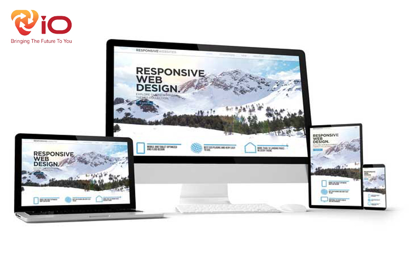
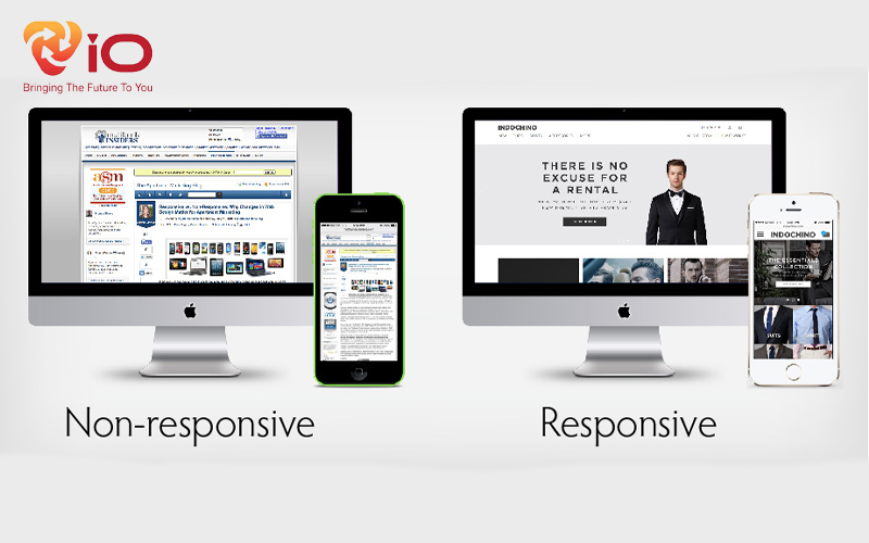
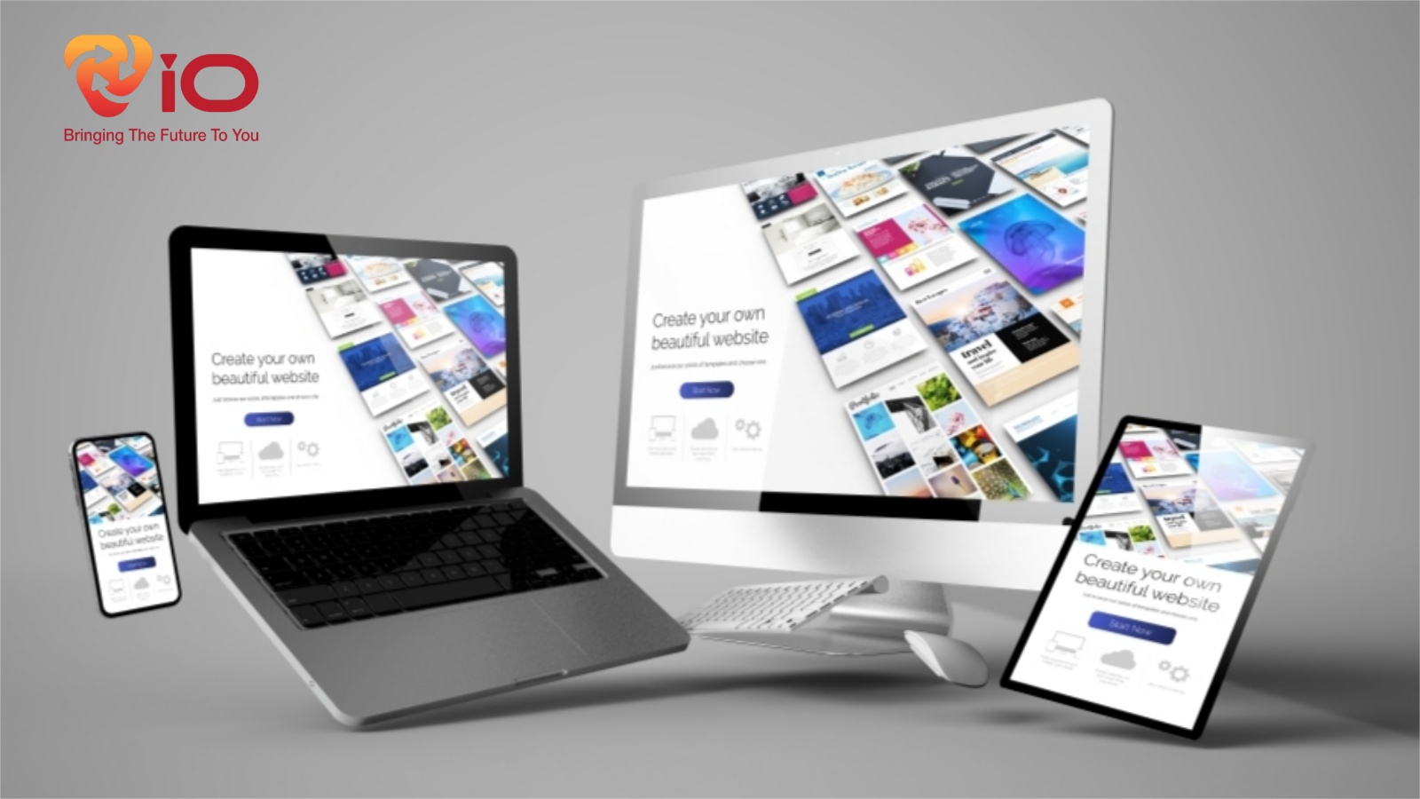
What is Responsive?
Responsive is understood as a design style so that your website fits all devices at all different screen resolutions. Websites are only truly beautiful when they have clear layouts, balanced images, and fully display on all devices. A website that meets that condition will be called a responsive website. For example, a web page displayed on a computer screen in Vietnam is 960 px. But for mobile screen, that size will show smaller around 320 and 480 px.
If traditional websites use pixels as the unit of measurement. Then responsive designers will often take percentages.
See also : What is Footprint in SEO?
Responsive Strength
- This is a site style with responsive sizes is most commonly used today. It can be used on most screen resolutions with just one database and one website layout. Adjustments will be made by CSS.
- Responsive web design is the best mobile site currently available. Displaying your website clearly and concisely increases your credibility and shows your professionalism.
- Can be used on any website, any design language.
Popular responsive sizes
Basic responsive sizing commonly used in website design includes.
- Mobile: max-width 320px when displayed vertically and 480px when displayed horizontally.
- Tablets: max-width 600px when displayed vertically and 800px displayed horizontally.
- Large tablets: max-width 768px in portrait and 1024px in landscape.
Some notes in responsive website design.
Breakpoint
To correctly determine responsive sizes requires some familiarity with the term breakpoint. This is the point where the website will reformat to give the user the best and most efficient layout. Thereby providing a better experience when accessing the website. These breakpoints will target resolution of the screen and more specifically, the screen width.
See also : What is KOL in marketing?
Why aim for width?
Many people will wonder that screen size has width and height so why do people often care about width.
- Users will expect the site to fit in the browser window so they can scroll down. But won’t like sites with horizontal scrollbars.
- Height is relative and it is difficult to determine the right layout.
- When using a phone or tablet, vertical scrolling is more convenient for users. Dragging horizontally is time consuming and annoying.
Organize website content
It will be difficult to determine that users will drag to the end when accessing your site. Therefore, the designer needs to arrange the information in descending order of importance to ensure that the important information will be seen by the user.
What will change in each responsive size?
Set the CSS rules and you will get a website suitable for the device used to access. However, these settings will change the site layout. Specifically, changes to the website include:
- Change the font color and spacing between objects.
- Change image
- Show or hide elements.
- Change the layout and width of the website.
- Change interface elements like buttons to be more appropriate.
The above is sharing about responsiveness and responsive sizes currently now. To create a website that is suitable for most devices, designers are flexible in changing the layout of the website. Hopefully the above information can help you better understand responsive web design.
If you need to design a beautiful standard website to attract customers, you can contact Vio company for the best advice and support.


